自适应:不同大小设备呈现同样的页面效果,只是文字、图片等的大小不一样,但是相对位置一样。即在不同大小设备看起来一样。
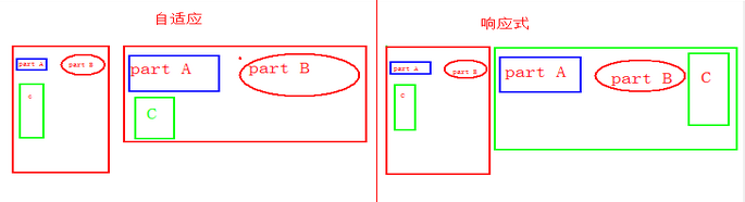
自适应布局允许网页宽度或高度自动调整,以获得良好的用户体验。
自适应布局主要包括高度自适应和宽度自适应,下面我们通过实例讲解自适应布局的实现方法。
高度自适应布局

原理就是把每个模块设置为绝对定位,然后设置中间自适应的模块的top和bottom属性的值分别为头部模块和底部模块的高,然后中间模块的高度就自适应了。
html代码:
<div class="top">
       120px
</div>
<div class="main">
       自适应
</div>
<div class="bottom">
       120px
</div>
css代码:
.top{
    width: 100%;
    height: 120px;
    position: absolute;
    background-color: greenyellow;

}
.main{
    position: absolute;
    width: 100%;
    top: 120px;
    bottom: 120px;
    background-color: azure;
    height: auto;
}
.bottom{
    position: absolute;
    bottom: 0;//别漏了
    width: 100%;
    height: 120px;
    background-color:greenyellow ;
}
宽度自适应布局

有三种方法:
- 绝对定位;
- 利用margin,中间模块先渲染;
- 自身浮动。
1、绝对定位
用绝对定位来设置宽度自适应布局,原理:针对自适应模块使用绝对定位,在把left和right设置为左右两列的宽,其实原理和高度自适应一样,另外左右两列分别左右浮动。
html代码:
<div class="left">
    200px
</div>
<div class="main">
    自适应
</div>
<div class="right">
    200px
</div>
css代码:
html,
body {
    margin: 0;
    height: 100%;
    padding: 0;
    font-size: 30px;
    font-weight: 500;
    text-align: center;
}

.left,
.right {
    width: 200px;
    display: inline;
    height: 100%;
    background-color: greenyellow;
}

.left {
    float: left;
}

.right {
    float: right;
}

.main {
    position: absolute;
    left: 200px;
    right: 200px;
    height: 100%;
    background-color: azure;
    display: inline;
}
125jz网原创文章。发布者:江山如画,转载请注明出处:http://www.125jz.com/1342.html
 微信扫一扫
微信扫一扫  支付宝扫一扫