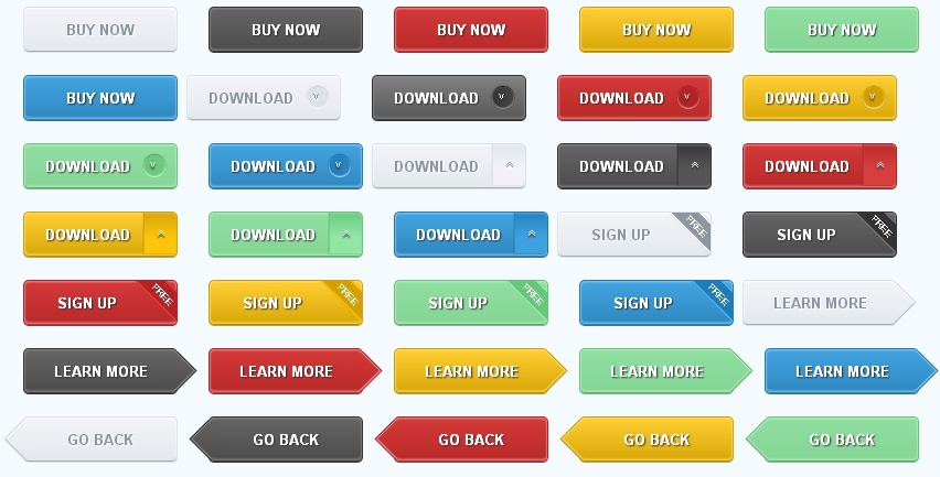
36个漂亮的CSS3动态按钮,纯CSS制作无图片 江山如画 • 2020年2月2日 下午5:29 • 网页制作 • 阅读 10972 36个漂亮的纯CSS制作的动态按钮。 随着HTML5/CSS3技术日趋成熟,现如今被越来越多的网站广泛的运用。 中国网页设计为大家收集整理最新的CSS3按钮代码。 <!DOCTYPE HTML> <html lang="en-US"> <head> <meta charset="UTF-8"> <title>36个漂亮的CSS3网页按钮Button样式|www.125jz.com</title> <style type="text/css"> body { background: #f5faff; } .demo_con { width: 960px; margin: 40px auto 0; } .button { width: 140px; line-height: 38px; text-align: center; font-weight: bold; color: #fff; text-shadow: 1px 1px 1px #333; border-radius: 5px; margin: 0 20px 20px 0; position: relative; overflow: hidden; } .button:nth-child(6n) { margin-right: 0; } .button.gray { color: #8c96a0; text-shadow: 1px 1px 1px #fff; border: 1px solid #dce1e6; box-shadow: 0 1px 2px #fff inset, 0 -1px 0 #a8abae inset; background: -webkit-linear-gradient(top, #f2f3f7, #e4e8ec); background: -moz-linear-gradient(top, #f2f3f7, #e4e8ec); background: linear-gradient(top, #f2f3f7, #e4e8ec); } .button.black { border: 1px solid #333; box-shadow: 0 1px 2px #8b8b8b inset, 0 -1px 0 #3d3d3d inset, 0 -2px 3px #8b8b8b inset; background: -webkit-linear-gradient(top, #656565, #4c4c4c); background: -moz-linear-gradient(top, #656565, #4a4a4a); background: linear-gradient(top, #656565, #4a4a4a); } .button.red { border: 1px solid #b42323; box-shadow: 0 1px 2px #e99494 inset, 0 -1px 0 #954b4b inset, 0 -2px 3px #e99494 inset; background: -webkit-linear-gradient(top, #d53939, #b92929); background: -moz-linear-gradient(top, #d53939, #b92929); background: linear-gradient(top, #d53939, #b92929); } .button.yellow { border: 1px solid #d2a000; box-shadow: 0 1px 2px #fedd71 inset, 0 -1px 0 #a38b39 inset, 0 -2px 3px #fedd71 inset; background: -webkit-linear-gradient(top, #fece34, #d8a605); background: -moz-linear-gradient(top, #fece34, #d8a605); background: linear-gradient(top, #fece34, #d8a605); } .button.green { border: 1px solid #64c878; box-shadow: 0 1px 2px #b9ecc4 inset, 0 -1px 0 #6c9f76 inset, 0 -2px 3px #b9ecc4 inset; background: -webkit-linear-gradient(top, #90dfa2, #84d494); background: -moz-linear-gradient(top, #90dfa2, #84d494); background: linear-gradient(top, #90dfa2, #84d494); } .button.blue { border: 1px solid #1e7db9; box-shadow: 0 1px 2px #8fcaee inset, 0 -1px 0 #497897 inset, 0 -2px 3px #8fcaee inset; background: -webkit-linear-gradient(top, #42a4e0, #2e88c0); background: -moz-linear-gradient(top, #42a4e0, #2e88c0); background: linear-gradient(top, #42a4e0, #2e88c0); } .round, .side, .tags { padding-right: 30px; } .round:after { position: absolute; display: inline-block; content: "03c"; top: 50%; right: 10px; margin-top: -10px; width: 17px; height: 20px; padding-left: 3px; line-height: 18px; font-size: 10px; font-weight: normal; border-radius: 10px; text-shadow: -2px 0 1px #333; -webkit-transform: rotate(-90deg); -moz-transform: rotate(-90deg); transform: rotate(-90deg); } .gray.round:after { box-shadow: 1px 0 1px rgba(255,255,255,1) inset, 1px 0 1px rgba(0,0,0,.2); background: -webkit-linear-gradient(top, #dce1e6, #dde2e7); background: -moz-linear-gradient(top, #dce1e6, #dde2e7); background: linear-gradient(top, #dce1e6, #dde2e7); text-shadow: -2px 0 1px #fff; } .black.round:after { box-shadow: 1px 0 1px rgba(255,255,255,.5) inset, 1px 0 1px rgba(0,0,0,.9); background: -webkit-linear-gradient(top, #333, #454545); background: -moz-linear-gradient(top, #333, #454545); background: linear-gradient(top, #333, #454545); } .red.round:after { box-shadow: 1px 0 1px rgba(255,255,255,.6) inset, 1px 0 1px rgba(130,25,25,.9); background: -webkit-linear-gradient(top, #b12222, #b42323); background: -moz-linear-gradient(top, #b12222, #b42323); background: linear-gradient(top, #b12222, #b42323); } .yellow.round:after { box-shadow: 1px 0 1px rgba(255,255,255,.8) inset, 1px 0 1px rgba(148,131,4,.9); background: -webkit-linear-gradient(top, #cf9d00, #d2a000); background: -moz-linear-gradient(top, #cf9d00, #d2a000); background: linear-gradient(top, #cf9d00, #d2a000); } .green.round:after { box-shadow: 1px 0 1px rgba(255,255,255,.8) inset, 1px 0 1px rgba(51,126,66,.9); background: -webkit-linear-gradient(top, #64c878, #6dcb80); background: -moz-linear-gradient(top, #64c878, #6dcb80); background: linear-gradient(top, #64c878, #6dcb80); } .blue.round:after { box-shadow: 1px 0 1px rgba(255,255,255,.8) inset, 1px 0 1px rgba(18,85,128,.9); background: -webkit-linear-gradient(top, #1e7db9, #2b85bd); background: -moz-linear-gradient(top, #1e7db9, #2b85bd); background: linear-gradient(top, #1e7db9, #2b85bd); } .side:after { position: absolute; display: inline-block; content: "0bb"; top: 3px; right: -4px; width: 38px; height: 30px; font-weight: normal; line-height: 26px; border-radius: 0 0 5px 5px; text-shadow: -2px 0 1px #333; -webkit-transform: rotate(-90deg); -moz-transform: rotate(-90deg); transform: rotate(-90deg); } .gray.side:after { text-shadow: -2px 0 1px #fff; border-top: 1px solid #d4d4d4; box-shadow: -2px 0 1px #eceef1 inset; background: -webkit-linear-gradient(right, #e1e6ea, #f2f2f6 60%); background: -moz-linear-gradient(right, #e1e6ea, #f2f2f6 60%); background: linear-gradient(right, #e1e6ea, #f2f2f6 60%); } .black.side:after { border-top: 1px solid #222; box-shadow: -2px 0 1px #606060 inset; background: -webkit-linear-gradient(right, #373737, #555 60%); background: -moz-linear-gradient(right, #373737, #555 60%); background: linear-gradient(right, #373737, #555 60%); } .red.side:after { border-top: 1px solid #aa1e1e; box-shadow: -2px 0 1px #c75959 inset; background: -webkit-linear-gradient(right, #b82929, #d73f3f 60%); background: -moz-linear-gradient(top, #b82929, #d73f3f 60%); background: linear-gradient(top, #b82929, #d73f3f 60%); } .yellow.side:after { border-top: 1px solid #ba8f06; box-shadow: -2px 0 1px #deb842 inset; background: -webkit-linear-gradient(right, #d5a406, #fdc40b 60%); background: -moz-linear-gradient(right, #d5a406, #fdc40b 60%); background: linear-gradient(right, #d5a406, #fdc40b 60%); } .green.side:after { border-top: 1px solid #53b567; box-shadow: -2px 0 1px #8ad599 inset; background: -webkit-linear-gradient(right, #69ca7c, #91e5a5 60%); background: -moz-linear-gradient(right, #69ca7c, #91e5a5 60%); background: linear-gradient(right, #69ca7c, #91e5a5 60%); } .blue.side:after { border-top: 1px solid #1971a8; box-shadow: -2px 0 1px #559dca inset; background: -webkit-linear-gradient(right, #2482bd, #3fa2e0 60%); background: -moz-linear-gradient(right, #2482bd, #3fa2e0 60%); background: linear-gradient(right, #2482bd, #3fa2e0 60%); } .tags:after { font-weight: normal; position: absolute; display: inline-block; content: "FREE"; top: -3px; right: -33px; color: #fff; text-shadow: none; width: 85px; height: 25px; line-height: 28px; -webkit-transform: rotate(45deg) scale(.7, .7); -moz-transform: rotate(45deg) scale(.7, .7); transform: rotate(45deg) scale(.7, .7); } .gray.tags:after { background: #8c96a0; border: 2px solid #fff; } .black.tags:after { background: #333; border: 2px solid #777; } .red.tags:after { background: #b42323; border: 2px solid #df4141; } .yellow.tags:after { background: #d2a000; border: 2px solid #fcc100; } .green.tags:after { background: #64c878; border: 2px solid #9bebac; } .blue.tags:after { background: #1e7db9; border: 2px solid #54b1e9; } .button.rarrow, .button.larrow { overflow: visible; } .rarrow:after, .rarrow:before, .larrow:after, .larrow:before { position: absolute; content: ""; display: block; width: 28px; height: 28px; -webkit-transform: rotate(45deg); -moz-transform: rotate(45deg); transform: rotate(45deg); } .rarrow:before { width: 27px; height: 27px; top: 6px; right: -13px; clip: rect(auto auto 26px 2px); } .rarrow:after { top: 6px; right: -12px; clip: rect(auto auto 26px 2px); } .gray.rarrow:before { background: #d6dbe0; } .gray.rarrow:after { box-shadow: 0 1px 0 #fff inset, -1px 0 0 #b7babd inset; background: -webkit-linear-gradient(top left, #f2f3f7, #e4e8ec); background: -moz-linear-gradient(top left, #f2f3f7, #e4e8ec); background: linear-gradient(top left, #f2f3f7, #e4e8ec); } .black.rarrow:before { background: #333; } .black.rarrow:after { box-shadow: 0 1px 0 #8B8B8B inset, -1px 0 0 #3d3d3d inset, -2px 0 0 #8B8B8B inset; background: -webkit-linear-gradient(top left, #656565, #4C4C4C); background: -moz-linear-gradient(top left, #656565, #4C4C4C); background: linear-gradient(top left, #656565, #4C4C4C); } .red.rarrow:before { background: #B42323; } .red.rarrow:after { box-shadow: 0 1px 0 #E99494 inset, -1px 0 0 #954B4B inset, -2px 0 0 #E99494 inset; background: -webkit-linear-gradient(top left, #D53939, #B92929); background: -moz-linear-gradient(top left, #D53939, #B92929); background: linear-gradient(top left, #D53939, #B92929); } .yellow.rarrow:before { background: #D2A000; } .yellow.rarrow:after { box-shadow: 0 1px 0 #FEDD71 inset, -1px 0 0 #A38B39 inset, -2px 0 0 #FEDD71 inset; background: -webkit-linear-gradient(top left, #FECE34, #D8A605); background: -moz-linear-gradient(top left, #FECE34, #D8A605); background: linear-gradient(top left, #FECE34, #D8A605); } .green.rarrow:before { background: #64C878; } .green.rarrow:after { box-shadow: 0 1px 0 #B9ECC4 inset, -1px 0 0 #6C9F76 inset, -2px 0 0 #B9ECC4 inset; background: -webkit-linear-gradient(top left, #90DFA2, #84D494); background: -moz-linear-gradient(top left, #90DFA2, #84D494); background: linear-gradient(top left, #90DFA2, #84D494); } .blue.rarrow:before { background: #1E7DB9; } .blue.rarrow:after { box-shadow: 0 1px 0 #8FCAEE inset, -1px 0 0 #497897 inset, -2px 0 0 #8FCAEE inset; background: -webkit-linear-gradient(top left, #42A4E0, #2E88C0); background: -moz-linear-gradient(top left, #42A4E0, #2E88C0); background: linear-gradient(top left, #42A4E0, #2E88C0); } .larrow:before { top: 6px; left: -13px; width: 27px; height: 27px; clip: rect(2px 26px auto auto); } .larrow:after { top: 6px; left: -12px; clip: rect(2px 26px auto auto); } .gray.larrow:before { background: #d6dbe0; } .gray.larrow:after { box-shadow: 0 -1px 0 #b7babd inset, 1px 0 0 #fff inset; background: -webkit-linear-gradient(top left, #f2f3f7, #e4e8ec); background: -moz-linear-gradient(top left, #f2f3f7, #e4e8ec); background: linear-gradient(top left, #f2f3f7, #e4e8ec); } .black.larrow:before { background: #333; } .black.larrow:after { box-shadow: 0 -1px 0 #3d3d3d inset, 0 -2px 0 #8B8B8B inset, 1px 0 0 #8B8B8B inset; background: -webkit-linear-gradient(top left, #656565, #4C4C4C); background: -moz-linear-gradient(top left, #656565, #4C4C4C); background: linear-gradient(top left, #656565, #4C4C4C); } .red.larrow:before { background: #B42323; } .red.larrow:after { box-shadow: 0 -1px 0 #954B4B inset, 0 -2px 0 #E99494 inset, 1px 0 0 #E99494 inset; background: -webkit-linear-gradient(top left, #D53939, #B92929); background: -moz-linear-gradient(top left, #D53939, #B92929); background: linear-gradient(top left, #D53939, #B92929); } .yellow.larrow:before { background: #D2A000; } .yellow.larrow:after { box-shadow: 0 -1px 0 #A38B39 inset, 0 -2px 0 #FEDD71 inset, 1px 0 0 #FEDD71 inset; background: -webkit-linear-gradient(top left, #FECE34, #D8A605); background: -moz-linear-gradient(top left, #FECE34, #D8A605); background: linear-gradient(top left, #FECE34, #D8A605); } .green.larrow:before { background: #64C878; } .green.larrow:after { box-shadow: 0 -1px 0 #6C9F76 inset, 0 -2px 0 #B9ECC4 inset, 1px 0 0 #B9ECC4 inset; background: -webkit-linear-gradient(top left, #90DFA2, #84D494); background: -moz-linear-gradient(top left, #90DFA2, #84D494); background: linear-gradient(top left, #90DFA2, #84D494); } .blue.larrow:before { background: #1E7DB9; } .blue.larrow:after { box-shadow: 0 -1px 0 #497897 inset, 0 -2px 0 #8FCAEE inset, 1px 0 0 #8FCAEE inset; background: -webkit-linear-gradient(top left, #42A4E0, #2E88C0); background: -moz-linear-gradient(top left, #42A4E0, #2E88C0); background: linear-gradient(top left, #42A4E0, #2E88C0); } .gray:hover { background: -webkit-linear-gradient(top, #fefefe, #ebeced); background: -moz-linear-gradient(top, #f2f3f7, #ebeced); background: linear-gradient(top, #f2f3f7, #ebeced); } .black:hover { background: -webkit-linear-gradient(top, #818181, #575757); background: -moz-linear-gradient(top, #818181, #575757); background: linear-gradient(top, #818181, #575757); } .red:hover { background: -webkit-linear-gradient(top, #eb6f6f, #c83c3c); background: -moz-linear-gradient(top, #eb6f6f, #c83c3c); background: linear-gradient(top, #eb6f6f, #c83c3c); } .yellow:hover { background: -webkit-linear-gradient(top, #ffd859, #e3bb38); background: -moz-linear-gradient(top, #ffd859, #e3bb38); background: linear-gradient(top, #ffd859, #e3bb38); } .green:hover { background: -webkit-linear-gradient(top, #aaebb9, #82d392); background: -moz-linear-gradient(top, #aaebb9, #82d392); background: linear-gradient(top, #aaebb9, #82d392); } .blue:hover { background: -webkit-linear-gradient(top, #70bfef, #4097ce); background: -moz-linear-gradient(top, #70bfef, #4097ce); background: linear-gradient(top, #70bfef, #4097ce); } .gray:active { top: 1px; box-shadow: 0 1px 3px #a8abae inset, 0 3px 0 #fff; background: -webkit-linear-gradient(top, #e4e8ec, #e4e8ec); background: -moz-linear-gradient(top, #e4e8ec, #e4e8ec); background: linear-gradient(top, #e4e8ec, #e4e8ec); } .black:active { top: 1px; box-shadow: 0 1px 3px #111 inset, 0 3px 0 #fff; background: -webkit-linear-gradient(top, #424242, #575757); background: -moz-linear-gradient(top, #424242, #575757); background: linear-gradient(top, #424242, #575757); } .red:active { top: 1px; box-shadow: 0 1px 3px #5b0505 inset, 0 3px 0 #fff; background: -webkit-linear-gradient(top, #b11a1a, #bf2626); background: -moz-linear-gradient(top, #b11a1a, #bf2626); background: linear-gradient(top, #b11a1a, #bf2626); } .yellow:active { top: 1px; box-shadow: 0 1px 3px #816b1f inset, 0 3px 0 #fff; background: -webkit-linear-gradient(top, #d3a203, #dba907); background: -moz-linear-gradient(top, #d3a203, #dba907); background: linear-gradient(top, #d3a203, #dba907); } .green:active { top: 1px; box-shadow: 0 1px 3px #4d7254 inset, 0 3px 0 #fff; background: -webkit-linear-gradient(top, #5eac6e, #72b37e); background: -moz-linear-gradient(top, #5eac6e, #72b37e); background: linear-gradient(top, #5eac6e, #72b37e); } .blue:active { top: 1px; box-shadow: 0 1px 3px #114566 inset, 0 3px 0 #fff; background: -webkit-linear-gradient(top, #1a71a8, #1976b1); background: -moz-linear-gradient(top, #1a71a8, #1976b1); background: linear-gradient(top, #1a71a8, #1976b1); } .gray.side:hover:after { background: -webkit-linear-gradient(right, #e7ebee, #f8f8f8 60%); background: -moz-linear-gradient(right, #e7ebee, #f8f8f8 60%); background: linear-gradient(right, #e7ebee, #f8f8f8 60%); } .black.side:hover:after { background: -webkit-linear-gradient(right, #555, #6f6f6f 60%); background: -moz-linear-gradient(right, #555, #6f6f6f 60%); background: linear-gradient(right, #555, #6f6f6f 60%); } .red.side:hover:after { background: -webkit-linear-gradient(right, #c43333, #dc4949 60%); background: -moz-linear-gradient(right, #c43333, #dc4949 60%); background: linear-gradient(right, #c43333, #dc4949 60%); } .yellow.side:hover:after { background: -webkit-linear-gradient(right, #e1b21a, #fbc71d 60%); background: -moz-linear-gradient(right, #e1b21a, #fbc71d 60%); background: linear-gradient(right, #e1b21a, #fbc71d 60%); } .green.side:hover:after { background: -webkit-linear-gradient(right, #85da95, #94e0a5 60%); background: -moz-linear-gradient(right, #85da95, #94e0a5 60%); background: linear-gradient(right, #85da95, #94e0a5 60%); } .blue.side:hover:after { background: -webkit-linear-gradient(right, #338fc8, #56b2eb 60%); background: -moz-linear-gradient(right, #338fc8, #56b2eb 60%); background: linear-gradient(right, #338fc8, #56b2eb 60%); } .gray.side:active:after { top: 4px; border-top: 1px solid #9fa6ab; box-shadow: -1px 0 1px #a8abae inset; background: -webkit-linear-gradient(right, #e4e8ec, #e4e8ec 60%); background: -moz-linear-gradient(right, #e4e8ec, #e4e8ec 60%); background: linear-gradient(right, #e4e8ec, #e4e8ec 60%); } .black.side:active:after { box-shadow: -1px 0 1px #111 inset; background: -webkit-linear-gradient(right, #414040, #4d4c4c 60%); background: -moz-linear-gradient(right, #414040, #4d4c4c 60%); background: linear-gradient(right, #414040, #4d4c4c 60%); } .red.side:active:after { box-shadow: -1px 0 1px #4b0707 inset; background: -webkit-linear-gradient(right, #b11a1a, #b11a1a 60%); background: -moz-linear-gradient(right, #b11a1a, #b11a1a 60%); background: linear-gradient(right, #b11a1a, #b11a1a 60%); } .yellow.side:active:after { box-shadow: -1px 0 1px #816b1f inset; background: -webkit-linear-gradient(right, #d3a203, #dba907 60%); background: -moz-linear-gradient(right, #d3a203, #dba907 60%); background: linear-gradient(right, #d3a203, #dba907 60%); } .green.side:active:after { box-shadow: -1px 0 1px #33663d inset; background: -webkit-linear-gradient(right, #63a870, #72b37e 60%); background: -moz-linear-gradient(right, #63a870, #72b37e 60%); background: linear-gradient(right, #63a870, #72b37e 60%); } .blue.side:active:after { box-shadow: -1px 0 1px #114566 inset; background: -webkit-linear-gradient(right, #1a71a8, #1976b1 60%); background: -moz-linear-gradient(right, #1a71a8, #1976b1 60%); background: linear-gradient(right, #1a71a8, #1976b1 60%); } .gray.rarrow:hover:after, .gray.rarrow:hover:after { background: -webkit-linear-gradient(top left, #fefefe, #ebeced); background: -moz-linear-gradient(top left, #fefefe, #ebeced); background: linear-gradient(top left, #fefefe, #ebeced); } .black.rarrow:hover:after, .black.larrow:hover:after { background: -webkit-linear-gradient(top left, #818181, #575757); background: -moz-linear-gradient(top left, #818181, #575757); background: linear-gradient(top left, #818181, #575757); } .red.rarrow:hover:after, .red.larrow:hover:after { background: -webkit-linear-gradient(top left, #eb6f6f, #c83c3c); background: -moz-linear-gradient(top left, #eb6f6f, #c83c3c); background: linear-gradient(top left, #eb6f6f, #c83c3c); } .yellow.rarrow:hover:after, .yellow.larrow:hover:after { background: -webkit-linear-gradient(top left, #ffd859, #e3bb38); background: -moz-linear-gradient(top left, #ffd859, #e3bb38); background: linear-gradient(top left, #ffd859, #e3bb38); } .green.rarrow:hover:after, .green.larrow:hover:after { background: -webkit-linear-gradient(top left, #aaebb9, #82d392); background: -moz-linear-gradient(top left, #aaebb9, #82d392); background: linear-gradient(top left, #aaebb9, #82d392); } .blue.rarrow:hover:after, .blue.larrow:hover:after { background: -webkit-linear-gradient(top left, #70bfef, #4097ce); background: -moz-linear-gradient(top left, #70bfef, #4097ce); background: linear-gradient(top left, #70bfef, #4097ce); } .gray.rarrow:active:after, .gray.larrow:active:after { background: -webkit-linear-gradient(top left, #e4e8ec, #e4e8ec); background: -moz-linear-gradient(top left, #e4e8ec, #e4e8ec); background: linear-gradient(top left, #e4e8ec, #e4e8ec); } .black.rarrow:active:after, .black.larrow:active:after { background: -webkit-linear-gradient(top left, #424242, #575757); background: -moz-linear-gradient(top left, #424242, #575757); background: linear-gradient(top left, #424242, #575757); } .red.rarrow:active:after, .red.larrow:active:after { background: -webkit-linear-gradient(top left, #b11a1a, #bf2626); background: -moz-linear-gradient(top left, #b11a1a, #bf2626); background: linear-gradient(top left, #b11a1a, #bf2626); } .yellow.rarrow:active:after, .yellow.larrow:active:after { background: -webkit-linear-gradient(top left, #d3a203, #dba907); background: -moz-linear-gradient(top left, #d3a203, #dba907); background: linear-gradient(top left, #d3a203, #dba907); } .green.rarrow:active:after, .green.larrow:active:after { background: -webkit-linear-gradient(top left, #63a870, #72b37e); background: -moz-linear-gradient(top left, #63a870, #72b37e); background: linear-gradient(top left, #63a870, #72b37e); } .blue.rarrow:active:after, .blue.larrow:active:after { background: -webkit-linear-gradient(top left, #1a71a8, #1976b1); background: -moz-linear-gradient(top left, #1a71a8, #1976b1); background: linear-gradient(top left, #1a71a8, #1976b1); } .gray.rarrow:active:after { box-shadow: 0 1px 0 #b7babd inset, -1px 0 0 #b7babd inset; } .gray.larrow:active:after { box-shadow: 0 -1px 0 #b7babd inset, 1px 0 0 #b7babd inset; } .black.rarrow:active:after { box-shadow: 0 1px 0 #333 inset, -1px 0 0 #333 inset; } .black.larrow:active:after { box-shadow: 0 -1px 0 #333 inset, 1px 0 0 #333 inset; } .red.rarrow:active:after { box-shadow: 0 1px 0 #640909 inset, -1px 0 0 #640909 inset; } .red.larrow:active:after { box-shadow: 0 -1px 0 #640909 inset, 1px 0 0 #640909 inset; } .yellow.rarrow:active:after { box-shadow: 0 1px 0 #816b1f inset, -1px 0 0 #816b1f inset; } .yellow.larrow:active:after { box-shadow: 0 -1px 0 #816b1f inset, 1px 0 0 #816b1f inset; } .green.rarrow:active:after { box-shadow: 0 1px 0 #4d7254 inset, -1px 0 0 #4d7254 inset; } .green.larrow:active:after { box-shadow: 0 -1px 0 #4d7254 inset, 1px 0 0 #4d7254 inset; } .blue.rarrow:active:after { box-shadow: 0 1px 0 #114566 inset, -1px 0 0 #114566 inset; } .blue.larrow:active:after { box-shadow: 0 -1px 0 #114566 inset, 1px 0 0 #114566 inset; } </style> </head> <body> <div class="page"> <header id="header"> <hgrounp class="white blank"> <h1>36种漂亮的CSS3网页按钮Button样式|www.125jz.com</h1> </hgrounp> </header> <section class="demo"> <div class="demo_con"> <button type="button" class="button gray">BUY NOW</button> <button type="button" class="button black">BUY NOW</button> <button type="button" class="button red">BUY NOW</button> <button type="button" class="button yellow">BUY NOW</button> <button type="button" class="button green">BUY NOW</button> <button type="button" class="button blue">BUY NOW</button> <button type="button" class="button gray round">DOWNLOAD</button> <button type="button" class="button black round">DOWNLOAD</button> <button type="button" class="button red round">DOWNLOAD</button> <button type="button" class="button yellow round">DOWNLOAD</button> <button type="button" class="button green round">DOWNLOAD</button> <button type="button" class="button blue round">DOWNLOAD</button> <button type="button" class="button gray side">DOWNLOAD</button> <button type="button" class="button black side">DOWNLOAD</button> <button type="button" class="button red side">DOWNLOAD</button> <button type="button" class="button yellow side">DOWNLOAD</button> <button type="button" class="button green side">DOWNLOAD</button> <button type="button" class="button blue side">DOWNLOAD</button> <button type="button" class="button gray tags">SIGN UP</button> <button type="button" class="button black tags">SIGN UP</button> <button type="button" class="button red tags">SIGN UP</button> <button type="button" class="button yellow tags">SIGN UP</button> <button type="button" class="button green tags">SIGN UP</button> <button type="button" class="button blue tags">SIGN UP</button> <button type="button" class="button gray rarrow">LEARN MORE</button> <button type="button" class="button black rarrow">LEARN MORE</button> <button type="button" class="button red rarrow">LEARN MORE</button> <button type="button" class="button yellow rarrow">LEARN MORE</button> <button type="button" class="button green rarrow">LEARN MORE</button> <button type="button" class="button blue rarrow">LEARN MORE</button> <button type="button" class="button gray larrow">GO BACK</button> <button type="button" class="button black larrow">GO BACK</button> <button type="button" class="button red larrow">GO BACK</button> <button type="button" class="button yellow larrow">GO BACK</button> <button type="button" class="button green larrow">GO BACK</button> <button type="button" class="button blue larrow">GO BACK</button> </div> </section> </div> </body> </html> Tips:You can change the code before run. 125jz网原创文章。发布者:江山如画,转载请注明出处:http://www.125jz.com/4656.html CSS 赞 (0) 江山如画管理团队 0 0 打赏 微信扫一扫 支付宝扫一扫 生成海报 巧用边框线实现立体按钮效果(纯CSS) 上一篇 2020年2月2日 下午5:20 Photoshop制作透明水晶圆形按钮 下一篇 2020年2月2日 下午5:38 99%的人还看了以下文章 网页制作 如何在网页中输入多个连续的空格? 默认状态下(输入法为半角状态),按空格键只能输入一个空格,要在文本之间插入多个连续的空格,可以使用以下几种方法: 1) 使用Ctrl+Shift+Space组合键。 2) 在中文全角状态下,使用空格键。 3) 选择【插入】→【HTML】→【特殊字符】命令下的“不换行空格”命令。 4) 直接在代码视图输入“ ”字符。 江山如画 2020年4月3日 29.5K03 网页制作 注册表单验证常用js代码:用户名、密码、邮箱等字段验证 <script language=”javascript”> //验证是否为数字 function IsDigit(cCheck) { return ((‘0′<=cCheck) && (cCheck<=’9’)); } //验证是否为英文字母 fun… 江山如画 2021年11月30日 3.3K02 网页制作 css布局基础:浮动和清除浮动练习2 主要知识点: 1、浮动:让元素脱离标准流,从而实现灵活的布局效果。 2、浮动只能左右,不能上下。float:left/right/none。 3、子元素浮动会造成父元素高度塌陷,清除浮动的3种方法: 方法1:通过overflow属性 方法2:通过clear属性 方法3:通过伪元素选择器(推荐) 效果图: 参考: <header> <img … 孙萍 2020年4月4日 4.5K00 网页制作 第9课:盒状模型 CSS中的盒状模型(box model)用于描述一个为HTML元素形成的矩形盒子。盒状模型还涉及为各个元素调整外边距(margin)、边框(border)、内边距(padding)和内容的具体操作。下图显示了盒状模型的结构: CSS中的盒状模型 上面的图示看上去可能感觉有点理论化,好吧,让我们试着用一个实例来解释盒状模型。在我们的例子中,有一个标题和一些文本… 江山如画 2020年2月25日 7.9K00 网页制作 第6课:超链接 CSS允许你根据链接是未访问的、已访问的、活动的、是否有鼠标悬停等分别定义不同的属性。这样,我们便可为网站增添奇特而有用的效果。 江山如画 2020年2月22日 2.8K03 网页制作 第5课:到目前为止学到了些什么? 上一课我们已经学习了这些: <html> <head><title></title></head> <body> </body> </html> 网页标题(title)写在head(头部)里:<title>网页标题写在这里</title>。… 江山如画 2018年1月20日 7.9K03 发表回复 请登录后评论...登录后才能评论 提交